Studying Brutalist Architecture and Lighting in UE4
George Garton prepared an extensive write-up on his UE4 scene Veiga Lighting Study discussing Brutalist style research, work with materials, water and lighting setup, and more.
In case you missed it
You might find these articles interesting
Introduction
My name is George Garton and I’m an Environment Artist from the UK. Currently, I’m freelancing but prior to that, I worked as a material artist at Sumo Digital on the PS5 title Sackboy: A Big Adventure. Before working in the industry I studied 3D Game Art at Southampton Solent University.
One of my most memorable encounters with the wonderful world of video games was when I was about 6 years old and my parents and I would sometimes visit this restaurant to meet with some relatives. Whilst waiting for my food I’d usually go off and play in the kids play area. However, on one of our visits to this restaurant I went to the play area like I usually do, only this time something had changed, there was a brand new arcade machine, towering over my 6-year-old self. I’d never used an arcade machine before and I was fascinated by this new device. This arcade machine housed a PS2 with Jak and Daxter: The Precursor Legacy on it. I was greatly intrigued by this new device so I gave it a go. I started playing and was blown away by how immersive this new medium was and how responsive it felt. So much so that my parents had a tough time pulling me away from it!
Needless to say, after that I begged my parents to get me a PS2, and from then on I was hooked.
I believe my journey to becoming an environment artist can be traced all the way back to my childhood. Even from a young age, I found myself spending far more time playing around with the level editors that shipped with certain games than playing the games themselves. I was blown away by the amount of creative freedom I had in Far Cry 2’s map editor and made countless different maps, ranging from multiplayer maps to linear story experiences. This childhood passion for creating my own digital worlds is what eventually led me to becoming the environment artist that I am today.
Quick side note: I think it’s really important for devs to release level editors with their games whenever possible to not only add more user-generated content to their games but also to inspire gamers to experiment with the creative side of games and possibly discover a love for it like I did!
Veiga Lighting Study: Inspiration and Research
One of my main goals behind starting a new portfolio project is to always try and focus the project on learning a new skill or improving upon a skill I’m less confident in. I’m confident in my modeling and texturing skills but felt that I could push my work further if I had a better grasp of lighting. With this in mind, I set out on a project where lighting would be my primary focus.
First things first, I had a look at some lighting studies on ArtStation. I noticed that quite a common approach is to use clean and simple geometry to really show off the lighting. Also using abstract architectural designs works quite well for adding some visual interest to the shape and shadows of a scene.
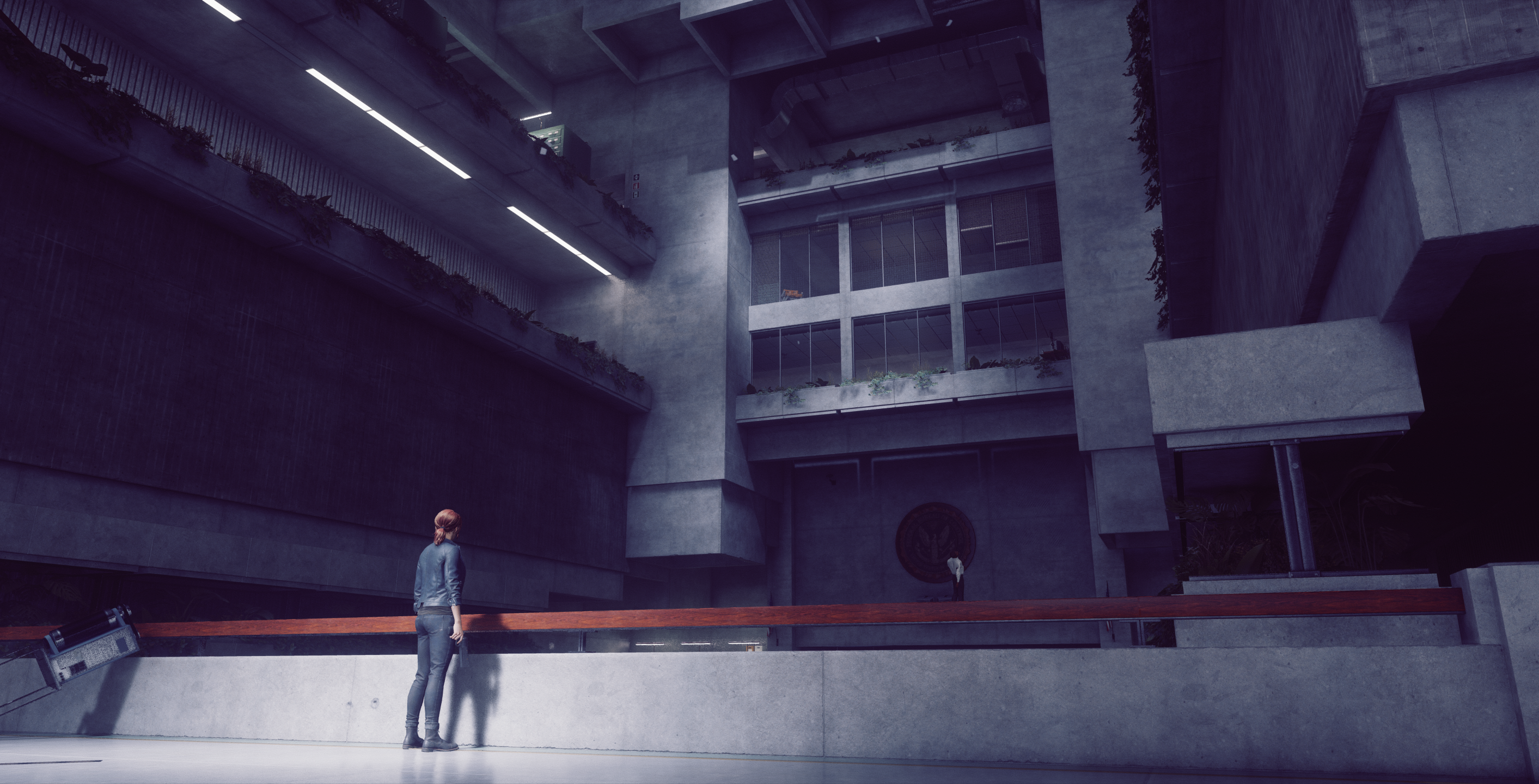
I knew from quite early on that I wanted to explore brutalist architecture with my scene because I’d developed a fascination with brutalism ever since walking passed this rather strange looking building when I was at university in Southampton.
The building is called Wyndham Court and was the first time I’d seen brutalist architecture in-person (I grew up in the countryside and didn’t visit the city very often). I was fascinated because it looked like something straight out of a dystopian film like Blade Runner or Judge Dredd. I asked some people what their thoughts were about the building and most called it ugly. While I can certainly see where they were coming from, I thought it’s bold and oppressive style was quite striking.
I researched brutalism some more and found the defining characteristics of brutalism are straight lines, heavy-looking materials (exposed concrete being a very common choice), unusual shapes, and repetitive modular elements. Brutalist buildings also often favour function over form.
I decided this brutalist style would be perfect for my lighting scene as it had the clean and simple geometric shapes that work so well for lighting studies. I also wanted to explore the emotions this type of architecture can make you feel. Brutalism is interesting because it has thematic connections between the form follows function style of architecture and reflecting an honest display of the brutal nature of the dystopian worlds/oppressive regimes it is so often associated with.
I wanted to investigate this further and always love sinking myself into whatever style of portfolio piece I’m working on so I watched a bunch of films featuring these dystopian societies such as:
- Blade Runner 2049
- Equilibrium
- 1984
I also played the fantastic Control by Remedy Entertainment which features a marvelous use of lighting and brutalism.
I think it’s great to expose yourself to as much of the media surrounding your chosen style for a portfolio piece as you can because it really gives you a good sense of the atmosphere of your chosen style.
So the atmosphere I wanted to go for was quite a clinical and impersonal one where my scene exits in an oppressive world. But I wanted the space within my scene specifically to feel like a safe solitude in this dystopian world. Somewhere you could come to get away from the worries of the outside world.
As with every project I created a Pinterest board of reference images relating to my scene. A good alternative to Pinterest is Pure Ref which allows you some more freedom with how you position and scale your reference images.
Starting the Scene
After creating the Pinterest board of references I then began narrowing down my choices to ones I was really fond of. One of the designs that really caught my eye was this design by the architectural firm Barozzi Veiga:
I really liked the sharp and angular shape language in this design. There’s quite a lot of triangular shapes in this scene which commonly represent power, strength, and law. Using this as my primary reference I then set about blocking out my scene in Blender and experimenting with ways of tweaking this design to my liking.
Originally, I had planned on having this deep descending pit instead of the water because I thought it added some mystery to the scene and further exaggerated the already huge concrete structures. But it looked a bit weird having this huge drop without a fence to stop people falling in. I tried adding in a fence but it detracted too much from my original goal of a very clean scene where the lighting itself is the focus.
Materials
I used a combination of Substance Designer and Megascans for my materials. Since Megascans has become free for UE4 users it’s opened up a huge amount of easily accessible high-quality assets and materials. But I still think it’s best to tweak the materials to your own personal liking, especially for portfolio pieces. For example, in my scene, I got a concrete slab material from Megascans and used Photoshop to remove some of the AO from the gaps between the slabs. I also removed some of the more unique grunge from the albedo that was causing repetition issues when tiled several times over in my scene. I then added some custom grunge to the roughness of this material to make it a bit more interesting.
The luminance of some of the base color maps I was using was also a little low for my liking. The problem with dark base color textures is a lot of the lighting gets absorbed by the darker texture rather than being bounced around the environment. So I lightened most of my textures to give me some more bounce lighting in my scene.
The marble material was created by taking a 4k marble texture from the internet and using Substance Designer to turn it into some marble tiles. I found black marble gave me some nice contrast to the materials in my scene so I inverted the original texture then used the directional warp node to create the individual tiles, then created the roughness and normal map inside Substance Designer.
I could have created the entire material inside Substance Designer from scratch but it wasn’t necessary in this case and would have just taken longer than is needed. In a studio environment time is money so it’s good practice to try and be as efficient as possible with your workflow and find ways of delegating your time sensibly.
Substance Designer graph for my marble material:
In order to get the slight offset in the reflection you can see in the bottom right of the image below I took some random tile colours and overlaid them at a really low intensity on my marble normal map in Substance Designer.
Having the marble tiling over such a long piece of geometry resulted in some pretty ugly repetition. To fix this I broke my walkway up into individual pieces that each had an unwrap that took up the entire UV space. I then rotated the UVs for some of these pieces to add variation to my marble material and fix the tiling issues.
Water
For the water I had some help from my good friend and talented tech artist Calvin Simpson. He helped me set up a feature in the water shader that allowed me to use a custom cubemap for the reflection of the water that, while not being physically accurate, did add a lot of realism to the feel of the water. This may be personal preference but I’ve found that sometimes it’s ok to bend the rules of PBR a bit in favour of a more artistic result.
Something I’ve always had an issue with in Unreal is refraction. I would always get issues where the reflection didn’t line up properly with the rest of the scene. This was solved by using ‘pixel normal offset’ mode in the refraction settings of the details of my material. This setting is especially noticeable on flat surfaces like water where the artifacts caused by the default method of refraction are most noticeable.
I used two panning normal maps at different scales to create the waves and ripples as well as a bit of tesselation to break up the straight edges around the edge of my water. I used depth fade to control the colour of my water at different depths and used a fresnel to give a slight green tint when viewing the water at more of an angle.
Caustics
To create the caustics in my scene I used this brilliant caustic generator by Bruno Afonseca on Substance Source for the caustic pattern.
In my material in Unreal, I offset the UVs of my caustics using panning normal maps which gave a really nice refraction. To do that I followed this fantastic tutorial by Ben Cloward:
Material Setup In-Engine
For my material setup in Unreal, I used a master material for all of my environment/prop related materials. This material allowed me to switch between using default texture coordinates or world aligned textures which allowed for fast prototyping of different materials at different scales without having to leave the engine and adjust the unwrap of my assets.
This material setup also allowed me to blend in detail textures for close up shots, as well as blending in macro textures to hide the tiling of my materials at longer distances.
Lighting
I wanted my sun light to be the primary light source in the scene that came flooding in through the ceiling and illuminated the interior. I used Pinterest again to gather some references of how sunlight illuminates interiors. The settings I used for my directional light are as follows:
Some settings to note are the temperature which I changed to 5000k to give a more neutral look to the sun. The indirect lighting intensity I increased to 5 to light up my interior some more, and the volumetric scattering intensity I increased to give me some stronger godrays (along with the volumetric fog I was using).
I increased the light source angle to make my shadows slightly softer and used area shadows to make the shadows get softer the further they are from the object casting the shadow (which is how shadows behave in real life).
I played around with different angles of sunlight but found this angle to be the best as it gave a good balance between light and shadow and illuminated a fair amount of the interior of my scene without blowing it out too much. I positioned a lightmass portal around the opening in the roof to guide more rays through the hole and give better lighting results.
I added the smaller lights to the scene to balance out the composition. I also used the smaller lights in conjunction with the grouting in my marble material to guide your eye in an anticlockwise direction around the scene.
I used spotlights for these lights since I only needed them to cast in one direction. The trick to making these lights work nicely with my sunlight was to not make them too intense as I didn’t want them detracting from the sunlight. I also wanted these lights to compliment my water so I made them slightly turquoise in colour (using the colour tint setting rather than temperature).
My friend and senior lighting artist Quentin Papleux offered some extremely useful feedback to me, among which he suggested that I add more humidity to the scene, so I did that by increasing the volumetric scattering intensity of my spotlights and adding some small point lights with a tiny intensity but huge volumetric scattering intensity so they worked like local fog actors.
To create the custom shape to the lights themselves I used IES profiles and downloaded some custom IES profiles from the internet. You can find a bunch of them for free but if you’re looking for a specific design you can sometimes find the IES profiles on the light manufacturer’s website.
Reflections
The reflections were set up by using planar reflections for the water and marble and a combination of box and sphere reflection captures for other parts of my scene.
The positioning of my reflection captures was key in getting the roughness details of my materials to really pop in my primary camera angle. It took a bit of playing around with the positioning/radius of my reflection captures to really get it right. As you can see in the following image I placed several sphere reflection captures near the spotlights, and one larger box reflection capture for the sunlit side of my scene.
Post-Production
For the colour grading of this scene, I was heavily inspired by Roger Deakins’ work on Blade Runner 2049 and how he was able to evoke such a strong atmosphere throughout the film. I wanted to go for quite a cold mood that evoked a dystopian atmosphere. But at the same time I wanted to retain some of the vibrance in the turquoise lights and water to give my scene a slight sense of tranquility within the authoritarian and oppressive world it exists in.
These are the post-production settings I used:
I adjusted the overall temperature because the original look to my scene was far too warm and I wanted a colder feel to this piece. I boosted the saturation and contrast slightly to make the scene ‘pop’ a bit more. I also reduced the saturation of the shadows and bumped up the saturation of the highlights to give some more contrast to my scene. I used a post-process material that sharpens the scene ever so slightly.
I set the camera shutter speed and aperture to 1 so I could control exposure through my ISO setting on my cinematic cameras themselves. Although this got a little fiddly when I wanted to adjust the aperture of the cameras to tweak the depth of field and it ended up adjusting the exposure too (like you would expect in real life).
These are the settings I used for my main camera:
It took some playing around with the focal length to get the shot looking the way I wanted, originally the FOV felt too high and dramatic so I brought the focal length up in order to bring the FOV down to make it less dramatic and a bit more cinematic. I also tweaked the aperture a little bit to get some subtle DOF.
Main Challenges
The biggest challenge I faced during production was deciding on a colour palette. Obviously there’s a tremendous amount of different colours, or colour combinations out there. So trying to decide on what would suit my scene took a lot of thought and testing. I tried to narrow it down using colour theory and going for colours that matched the cold and impersonal atmosphere and mood I was going for with this piece. One resource I found really useful for colour schemes is Canva’s colour palettes site where you can search for colour palettes using keywords.
I went for a more monochrome colour scheme as that’s quite common with dystopian style colour grading. I tried a few different monochrome colour schemes (such as the famous orange monochrome look from the desert in Blade Runner), but eventually settled on my more blue look because it fit the colder and more impersonal mood I was going for.
Another difficulty I faced was how much time I was wasting re-baking the scene every time I made a minor change to one of the lights. I tried switching to Luoshuang's fantastic GPU Lightmass. While this was far faster to bake than UE4’s default CPU lightmass, unfortunately, it has some limitations, the one that affected me the worst was: “Advanced lighting features such as soft shadows (SourceLength and SourceRadius) and IES are not respected when calculating indirect lighting.”
So I switched back to the default lightmass and used a different workaround to bypass my long bake times. I took the individual light I wanted to test, and the surface it was shining on, copied them with Ctrl+C, opened a new blank level, pasted them with Ctrl+V then baked the light there where I didn’t have to worry about all the other objects in the scene. This gave me some really fast results where I could tweak that individual light over and over without having to wait ages for a bake in my main level. I could also reposition the lights this way, then simply copy and paste them back to my original level and they would keep their positions and settings.
For example, here I used a blank level to test some lighting strip ideas I had early on in the project:
I spent quite a while on this project as I was primarily using it to learn and experiment with lighting, aside from experimenting, a large chunk of my time was spent watching tutorials and reading up on lighting. Speaking of which, I would highly recommend the Unreal 4 Lighting Academy tutorial videos on youtube by Tilmann Milde who is a senior lighting artist at Dice. He gives an incredibly detailed walkthrough of his lighting process and explains why he is doing everything that he does.
Another fantastic resource for learning more about lighting in Unreal, especially baked lighting is Tom Looman’s UE4 Lighting Masterclass. He breaks down all the important lightmass and directional light settings with comparison images of each setting.
What I learnt from this project is just how important lighting is in conveying mood and atmosphere, and how powerful lighting is in really bringing a scene to life. I went into this project with a rough idea of how important lighting is for these things, but to experience it firsthand and experiment with it myself gave me a newfound appreciation for the power of lighting.
If I was to do this scene again the main thing I would change is how I built thegeometry. Due to the shape of my scene, I made the mistake of simply using large assets and just cranking up the lightmap resolution for these pieces. What would have been a more efficient process would have been to create my scene in more modular pieces with individually lower resolution lightmaps. The way lightmass works in UE4, having more assets with lower-res lightmaps results in faster light baking than using fewer assets but with larger resolution lightmaps.
Afterword
If you made it this far, thanks for sticking with me. I know this was a long one! I hope you found some useful info in this breakdown. You can find more images from this project here.
George Garton, Environment Artist
Interview conducted by Arti Sergeev
Keep reading
You may find this article interesting